Interactive Example
Breadcrumbs provide a user with their current site location and allows them to quickly navigate to a parent page or previous step.
Rules of Thumb
- Don’t use Breadcrumbs as a replacement for the primary navigation.
- A Breadcrumb item label should match the page title that they link with.
Appearance and Behavior
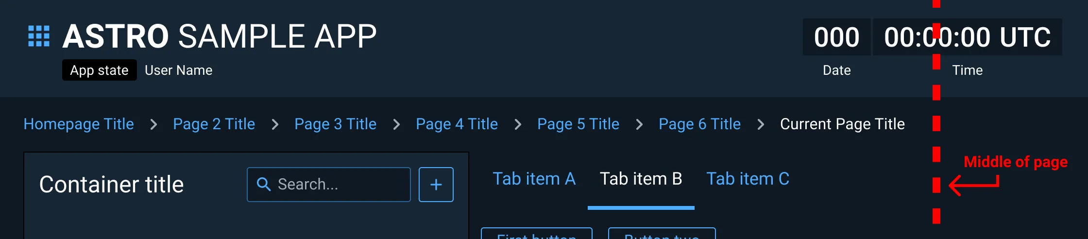
Breadcrumbs should be positioned in the top portion of a page, ideally below the application bar and primary navigation and above the page title (if present).
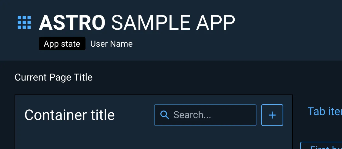
Each Breadcrumb item is comprised of a clickable page link followed by a dividing icon. However, the final Breadcrumb, representing the current page, has a static text label and no divider.
Breadcrumb links should be styled in the Astro-defined primary interactive color. Breadcrumb items that are hovered over should be styled in the interactive hover color and have no underline. The last current page Breadcrumb item should not be interactive and should be styled as the primary text color.
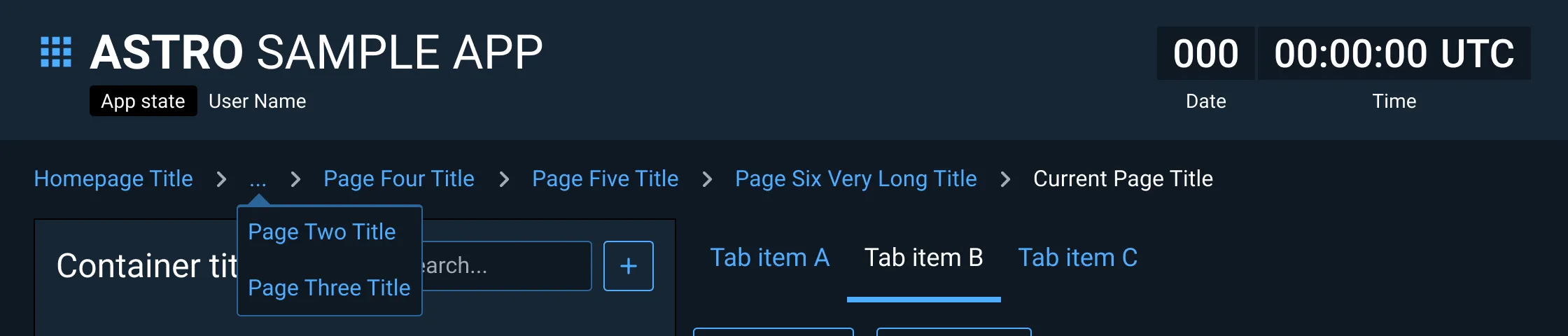
When used in applications intended for large monitors, Breadcrumb trails should span no more than half of the parent window’s width, beyond which label truncation or line wrapping should be used.
While presenting a single non-interactive Breadcrumb on a homepage is relatively uncommon, it is a permitted option.
Examples


Asset Status
| Asset | Version | Status |
|---|---|---|
| Documentation | N/A | Available |
| UI Kit - Dark | v7 | Available |
| UI Kit - Light | v7 | Available |
| UI Kit - Wireframe | v7 | Available |
| Web Component | v7 | Available |
| Component Tokens | N/A | Planned |